Well, the time has finally come. Today I am sharing our nursery reveal. This nursery was a labor of love that both my husband and I put time and effort into. I did most of the designing and he did ALL of the building.
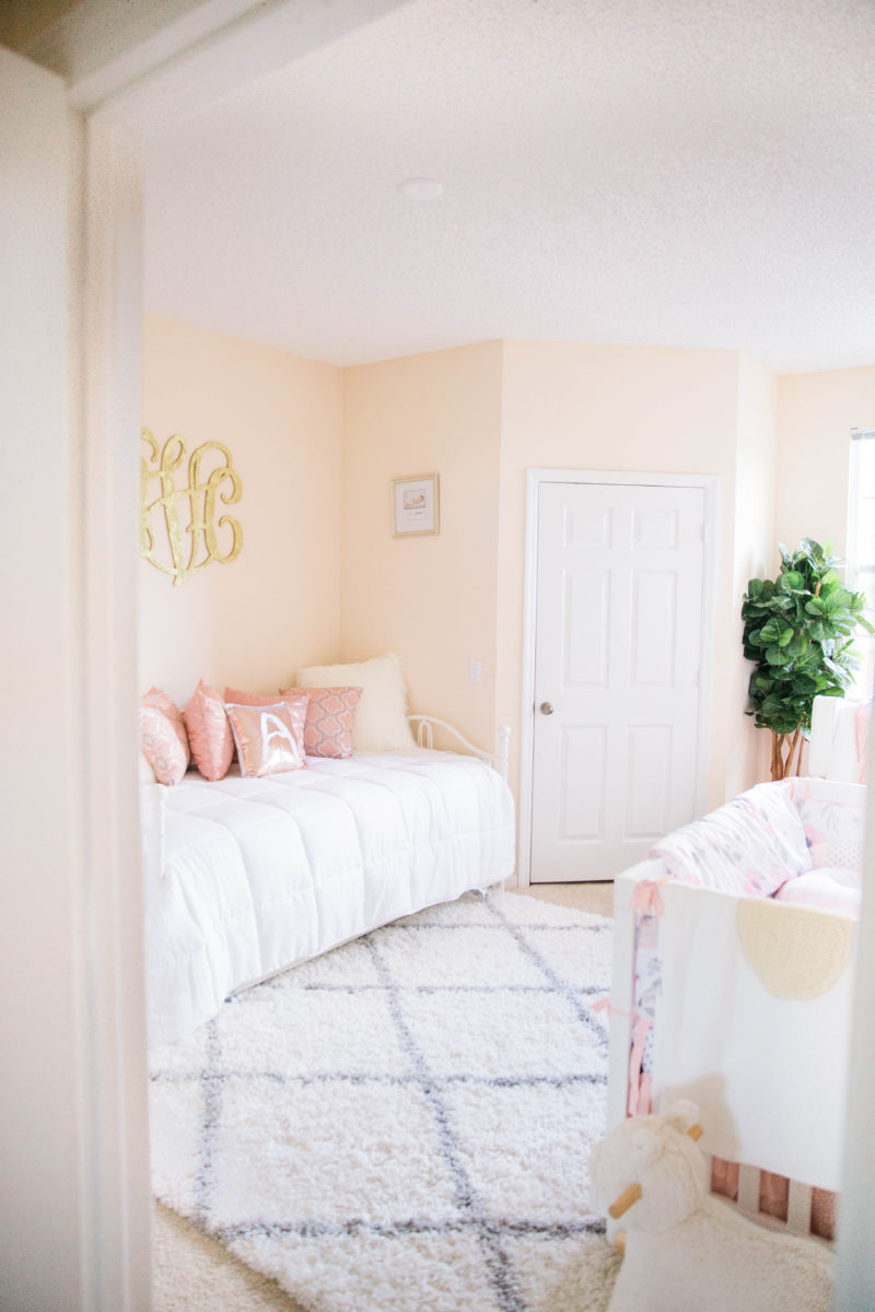
For the nursery, I wanted to keep it pretty neutral with pops of pink, which you can see from the color concept in the room. I wanted to paint the room but since we live in an apartment and we don’t know how long we will live here, I didn’t want to paint the walls and then have to paint them back once we left.
I did a lot of research about how to make the room look more spacious than it was. Surprisingly this space is our master bedroom. When we first moved into our apartment we couldn’t decide which room to use as our main room and ended up choosing the one designated for the guest room because we liked the layout.
Key Tip: White Furniture will always make smaller spaces look larger.

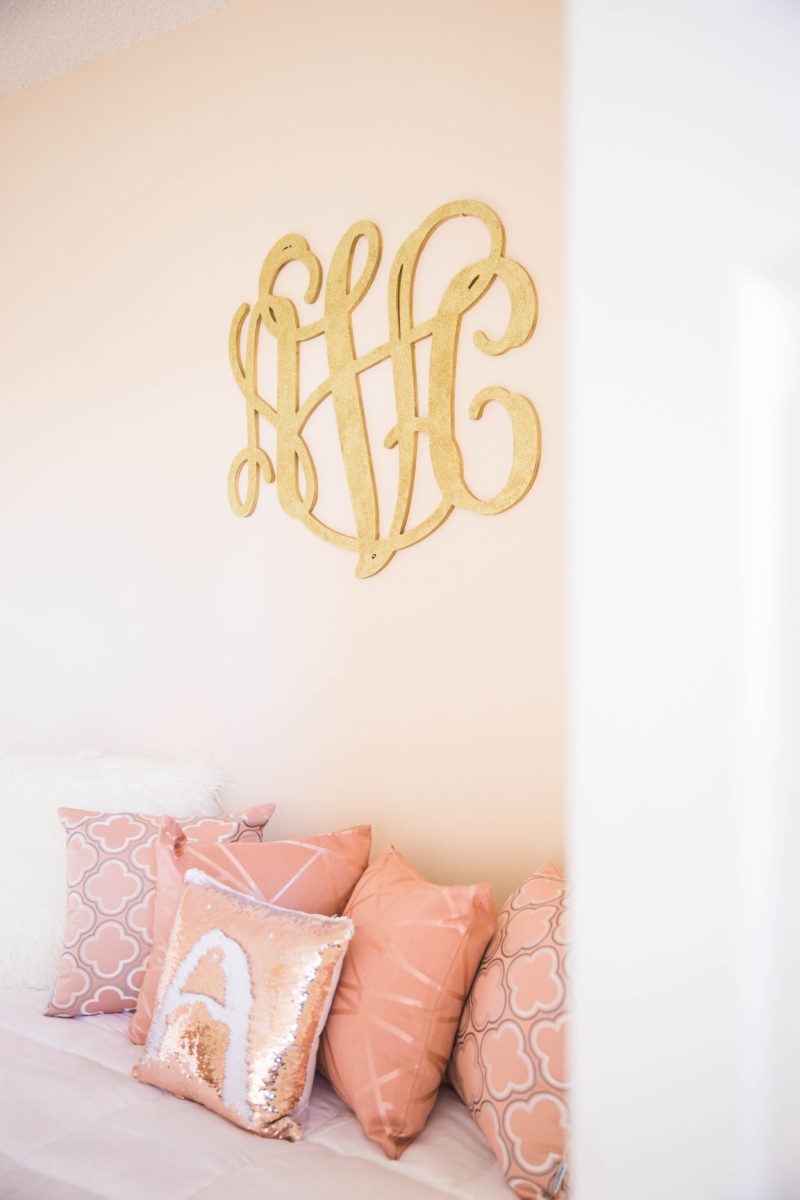
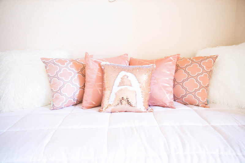
The first thing that you will notice when walking into the room is the Daybed. We decided to add a daybed to this room for my mom who will be staying with us for a little bit to help out with my new role in motherhood. I didn’t have a large budget but I wanted to have glamorous pieces to the room, which these accent pillows fit the bill. I’ve linked where I got them below.
I wanted to have something monogramed in the room and I found this gorgeous glitter wood monogram sign from Etsy. I wanted this room to grow with her and I figured that each piece could continue to grow with her, as she gets older.
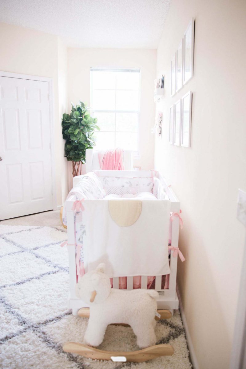
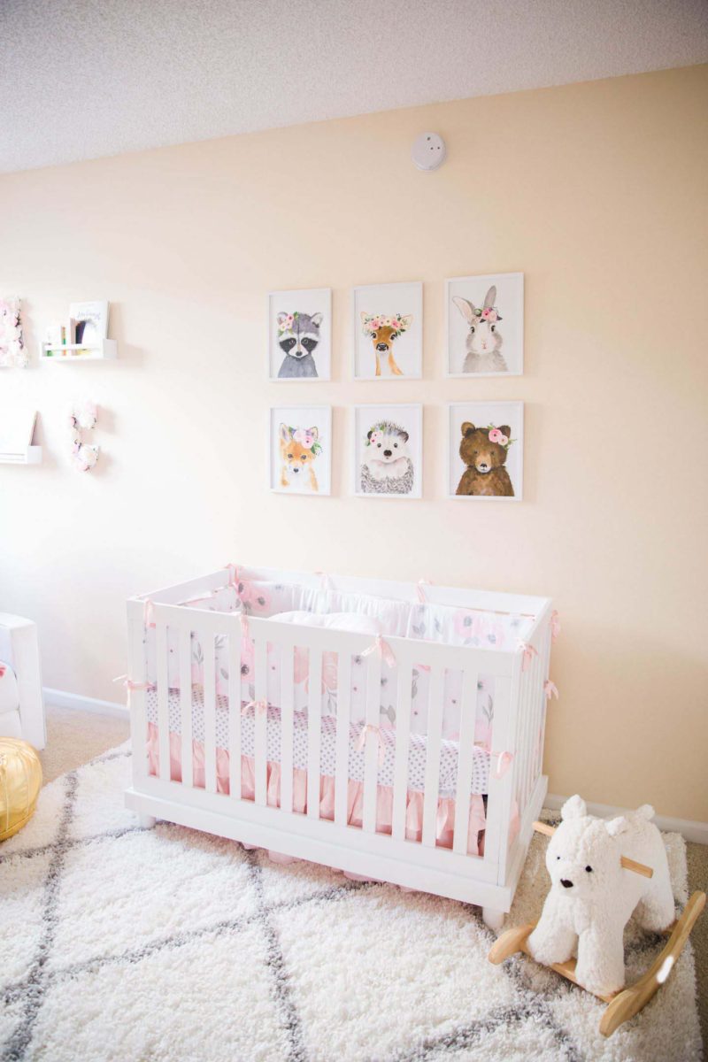
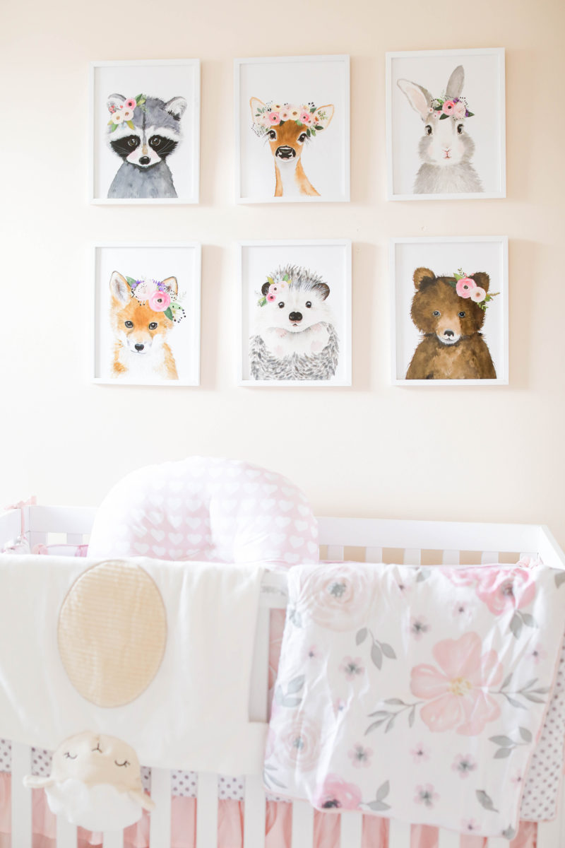
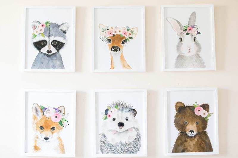
Directly in front of the daybed is the crib. I purchased these really cute animal prints from Etsy. I actually got the idea from another blogger, and became obsessed with them!
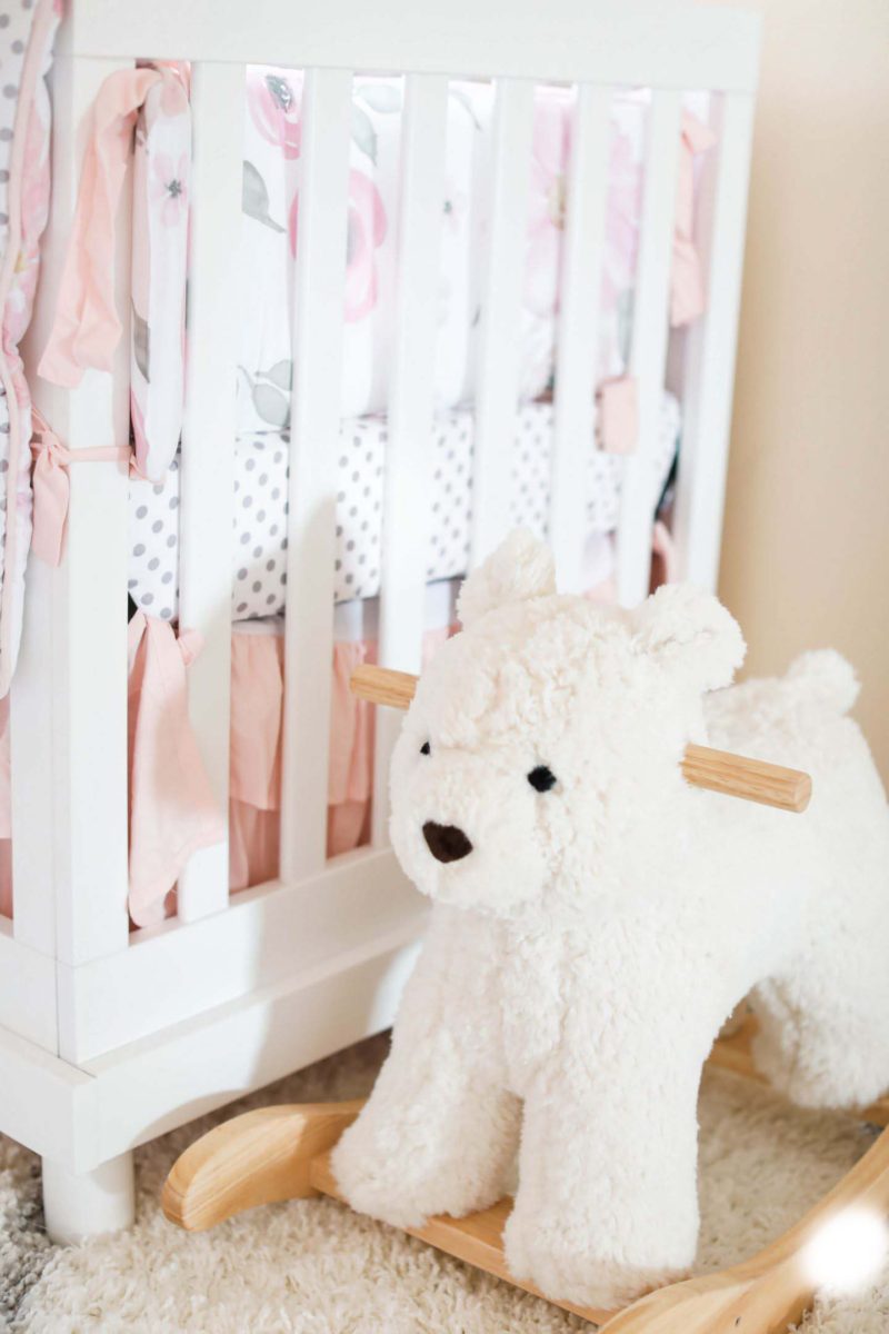
The rug was the perfect piece for the nursery because it tied so well with the color scheme. And of course I had to get this adorable rocker from pottery barn. I definitely feel like she will enjoy playing with this when she gets in her toddler stages.

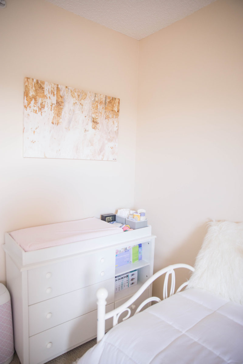
Again sticking to a neutral theme, I decided to go with a white changing table. Ladies, I am so happy with each of my purchases because I will be using these when we have more children, and white is so timeless that it really goes with everything. The artwork above the table has blush pink and gold tones, which added a bit more glam to the changing table area.
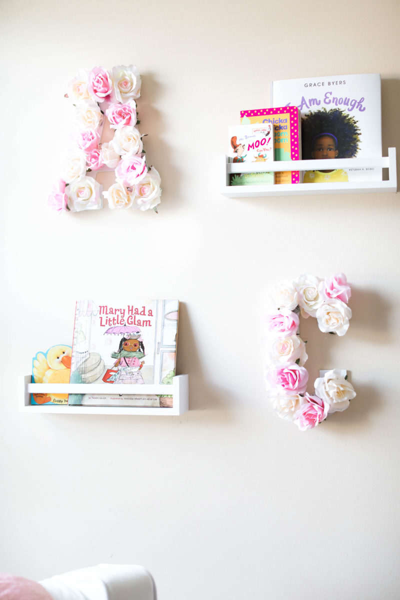
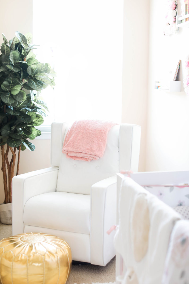
Last but certainly not least was the reading nook/ nursing area. I wanted this area to be cozy and comfortable with details of her books and initials. Perfect accents that I know she will love.
Overall, I wanted her to feel calm and peaceful in this room and I feel we were able to achieve that with this nursery.
What are your thoughts? Do you love it?

Photography: Coco Michele Photography
Shop the entire room below:


